EXTENSIVE Field Research FOR PLATFORM REDESIGN to Address Churn, COMPETITION, AND DELIGHT
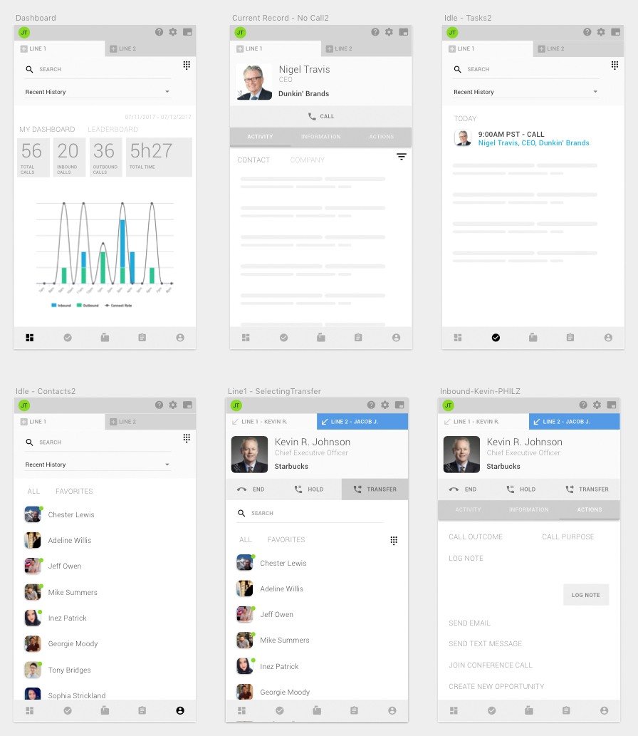
“I love doing everything in Tenfold since it's compact and doesn't take up a lot of space. All the CUSTOMER info IS there - in one place - so I can focus on the caller and not juggling tabs.” - Power User
Problem
The CEO and founder, Patrick Hogan, sought a trusted leader to oversee product responsibilities. With James Tucker's successful track record on past projects, he was brought in to address three key issues:
Competitor products had more features.
Tenfold had low NPS scores.
Longstanding customers were cancelling contracts.
James was tasked with developing a stable, scalable, and innovative product that would improve customer retention and increase sales. To identify pain points, he analyzed reports and conducted user research to uncover issues with product reliability, feature gaps, and overall product value.
A central part of this challenge was understanding the two primary personas driving the business:
Tenfold buyers (decision-makers who relied on power user feedback to assess product value).
Power users (those who handled complex workflows, juggling multiple systems like CRMs, customer portals, and knowledge bases during each call).
Power users faced constant multitasking, and their ability to manage customer interactions without distraction was critical for delivering quality service.
The original Tenfold interface, a Chrome extension, was difficult to navigate and didn't surface the necessary customer information efficiently, leading to frustration for users.
“I need to juggle the CRM, customer portal, and knowledge base while being an active listener with the customer. It's hard to catch everything they say when I am clicking all over the place. If the customer thinks I am not 100% into their issue, then I'll get a bad score.” - T-MOBILE AGENT
Before UI
The CHALLENGE
Tenfold lacked designers, product managers, and researchers, making it difficult to analyze whether product redesign and added features would be a sound business decision. James had to build the product and research teams from scratch, conduct an audit, and validate the need for a redesign. His approach involved testing both the current product and new prototypes to measure user behavior and emotional responses to changes.
Further complicating matters, Tenfold had no formal user research programs, and internal teams were initially resistant to customer access. To gain insights, James created a cross-departmental ambassador program, involving sales, accounts, support, and marketing in the redesign process. This engagement ensured visibility into customer experiences across various touchpoints and phases of the customer journey.
The Opportunity
By significantly improving the product and creating new opportunities for upselling, James helped position Tenfold to reduce churn and attract new clients. His redesign not only made the interface more user-friendly but also created features that justified higher pricing, enhancing the product's overall value.
Solution
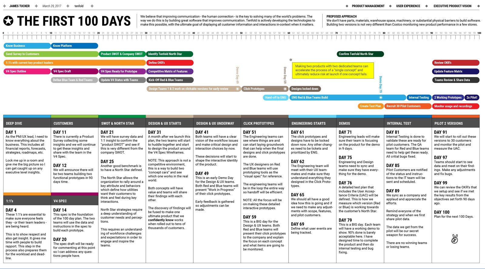
Appointed as VP of User Experience, James Tucker implemented a 100-day plan that included user research, product prototypes, and team building. His approach focused on lean innovation and defining a core persona, the power user. James theorized that if Tenfold could meet the needs of the power users, other personas would benefit, allowing for more complex use cases to be solved and new sales opportunities to be captured.
To future-proof the product, James also saw an opportunity in the rising preference for chat-based customer support. His solution was to build a highly flexible UI that could work across different platforms, including CRMs, desktop, mobile, and Chrome extensions. This flexibility would alleviate concerns from IT departments about compatibility, making Tenfold easier to sell.
Results
Through the implementation of design thinking and lean innovation practices, James transformed the culture at Tenfold, emphasizing that product development was everyone's responsibility. This mindset shift enabled the team to ship the redesigned product within 10 months, significantly improving both user workflows and company-wide efficiency.
Notable outcomes include:
Reduced workflow actions: Power users needed 5.5 fewer clicks per call, streamlining their day-to-day operations.
Improved customer retention: The new design added significant value, persuading customers to renew contracts and pay more for the product.
Enhanced customer satisfaction: Users appreciated the compact, intuitive interface that allowed them to focus more on customer interactions, not software navigation.


